 Stepping into a website that’s already well-established isn’t always easy. For starters, you have to be careful about not stepping on anyone’s toes (the client’s or even the previous designer’s) when providing feedback or suggestions on a new direction for the site. Secondly, there’s much more at stake with a redesign. Not only could a wrong turn hurt an established brand’s identity, but there’s also the disruption to SEO to consider.
That said, redesign projects can be incredibly rewarding. With from-scratch designs, there’s really no baseline to compare your work against. With a redesigned website, you can look back at the performance of the last iteration and compare it against what you’ve been able to accomplish.
If you’re intrigued by the prospect of tackling a redesign project, but spooked by the potential to do damage or get lost in the process, this guide breaks down what you need to do.
Phase 1: Ask Why
When approached with a redesign request, the first thing you should find out is, “Why?”
When it comes to redesigns, there are a number of reasons a client might be dissatisfied with the site as it stands:
Rebranding
Businesses don’t always maintain the same direction or goals. And sometimes a brand discovers its true identity after launch.
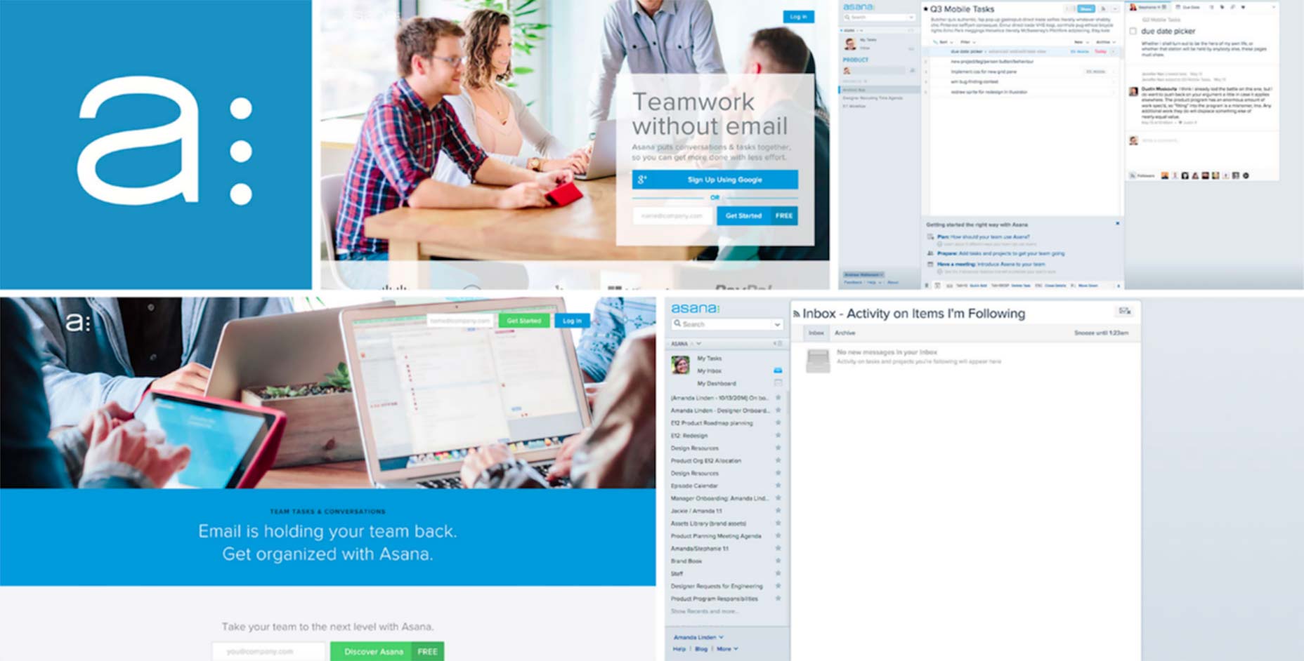
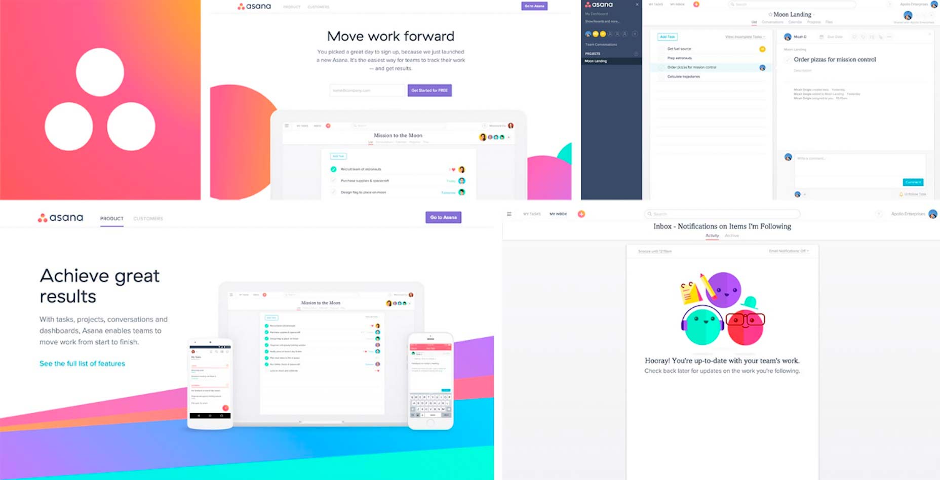
Asana’s branding story is an example of this. This is how their website and SaaS platform looked before:
As they explained, the true personality of the brand wasn’t effectively communicated through the logo, colors, and overall design. After assessing how they wanted their brand to be viewed, they pushed ahead with this redesign:
Missing Functionality
When the site was originally designed, your client perhaps hadn’t considered that they would need some key functionality for it.
Outdated Design
Design trends change so much in such a short amount of time. Clients that are cognizant of these changing trends may approach you if they feel their site is being left behind.
Not Responsive
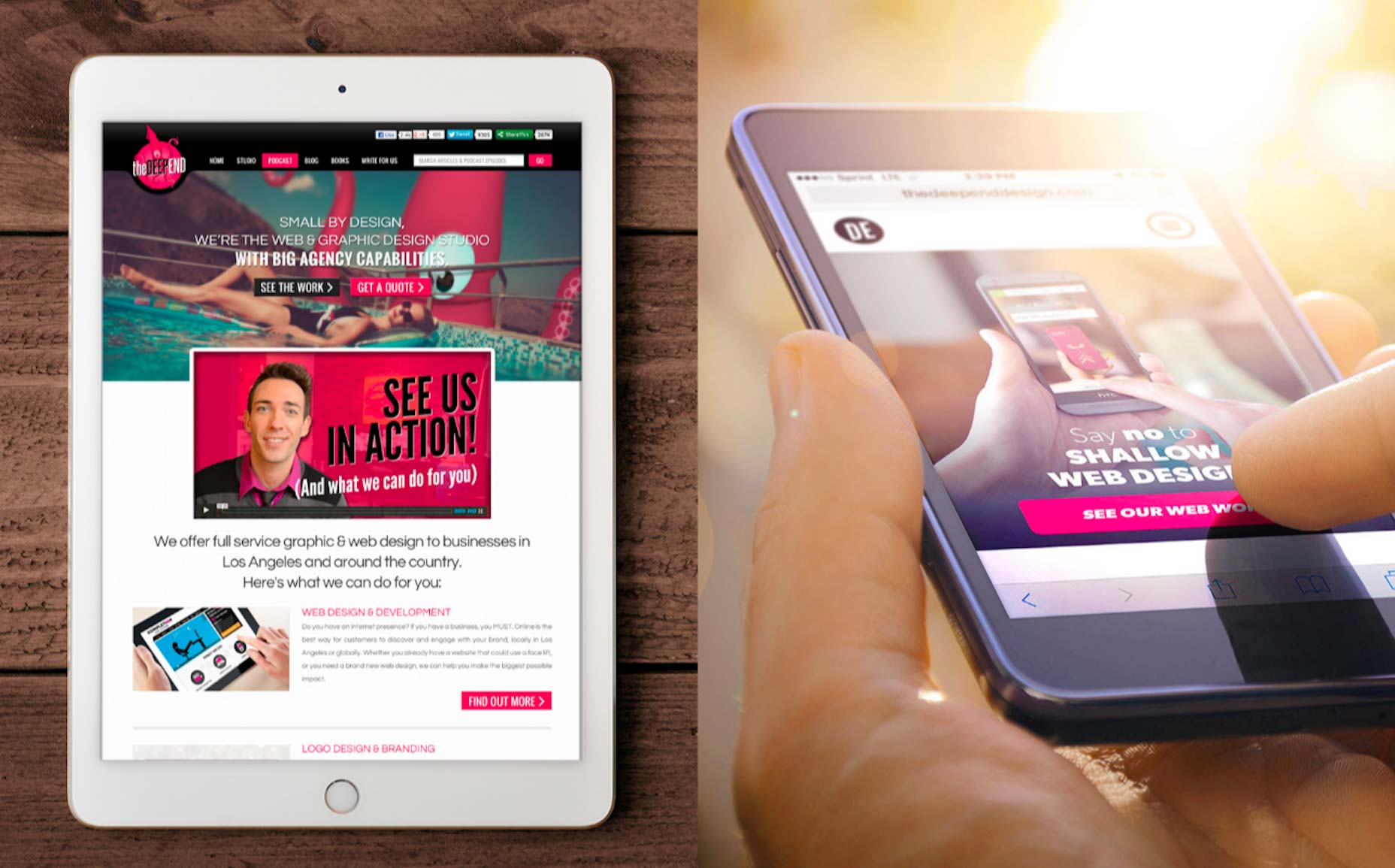
The original designer failed to anticipate the move to mobile-first and now your client is in a bad spot. The Deep End’s case study demonstrates how even the most technologically savvy of agencies could have missed this opportunity. But they were quick to remedy the problem:
Conversions Suck
They were initially excited about the launch of their website. Then, a month passes. A few more months pass. And, soon, a year has gone by and they have seen no results from it. They want to know what’s wrong and get it fixed immediately.
Be sure to get them to explain how they believe this redesign will help them achieve the website’s goals (and define exactly what those are, too).
Phase 2: Check the Data
Your client tells you what the perceived problem is with their site. Now, you need to dig into the data to see if it checks out. The client may be unhappy with a certain aspect of the site or the design as a whole. Their intuition is likely right, but you have to verify that the problem doesn’t lie somewhere else.
During this phase, dig deep into the following areas:
- Google Analytics
- Competitive landscape
- Keyword research
- UI design
- UX organization
Then, look at the entire website. Every. Single. Page. Do a full audit of what they have.
From this, you should be able to draw a conclusion about the true problem areas. Are there too many pages? Is the design misrepresenting what they do? Does the font need a refresh? Is there a key feature missing? Are images outdated or unoriginal looking? Build your redesign proposal from this and bring it to the client.
Phase 3: Devise a Plan
If you’ve never done a redesign project before, use the project workflow and checklists from your standard design projects. Review the steps and milestones against what you need to do in this redesign. Then, amend the steps, establish new milestones, and shape the redesign plan.
The tricky thing about this is that each redesign project will target different elements of a web design, which means adjusting your workflow from project to project. For instance, the redesign might only target:
- Branding like the logo, color palette, typography, imagery, iconography, etc. in which case, it might only be a superficial redesign;
- Navigation structure for improved user flow or a complete breakdown of the navigation to remove unnecessary pages;
- Home page content for clearer messaging and user persona targeting;
- Customer flow which was preventing the brand from capturing more conversions.
It’s not as if you don’t have experience with each of these elements. However, it’s the manner in which you work on each or how many of them you work on that will differ from a traditional web design. So, create your documentation, but leave it open to adjustment per the project’s requirements.
Phase 4: Implement the Redesign
Unless the website was a complete mess or total failure previously, chances are good your client will ask you to be careful in how dramatically you alter the design and content. To preserve the business’s integrity, you’ll have to strike a balance between creating a stronger identity for the brand while not completely destroying all recognition they’ve established with customers.
Site maps, storyboards, and prototypes should all factor into your process now (if they hadn’t already). These tools give you a chance to tackle the redesign in incremental steps and to check in with the client before moving on. You might even want to think about running A/B tests on the live website to confirm theories you have about problematic elements before implementing anything in the redesign.
Also, don’t forget how these changes will affect SEO. Unless the site is moving to a completely new domain, you will have to do what you can to preserve link juice. This means putting 301 redirects in place, maintaining the URL structures for the most popular pages and posts, putting a greater focus on the most successful keywords, and so on.
Should You Accept That Redesign Request?
I see no reason why you shouldn’t start accepting redesign requests, especially if you appreciate the problem-solving aspect of the work. That’s, of course, not to say you can’t flex your creative muscle here, but this sort of work will definitely appeal to those of you who like to strategize and test theories in design.
| Add Realistic Chalk and Sketch Lettering Effects with Sketch’it – only $5! |
This content was first posted here:
How to Tackle a Redesign


No comments:
Post a Comment